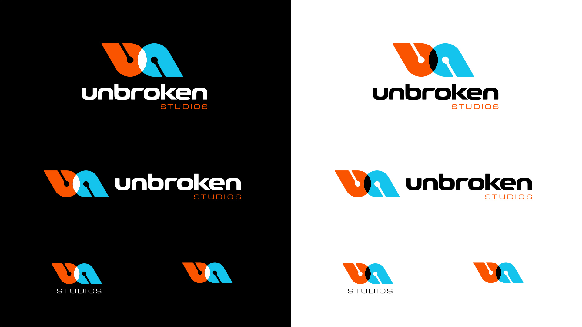
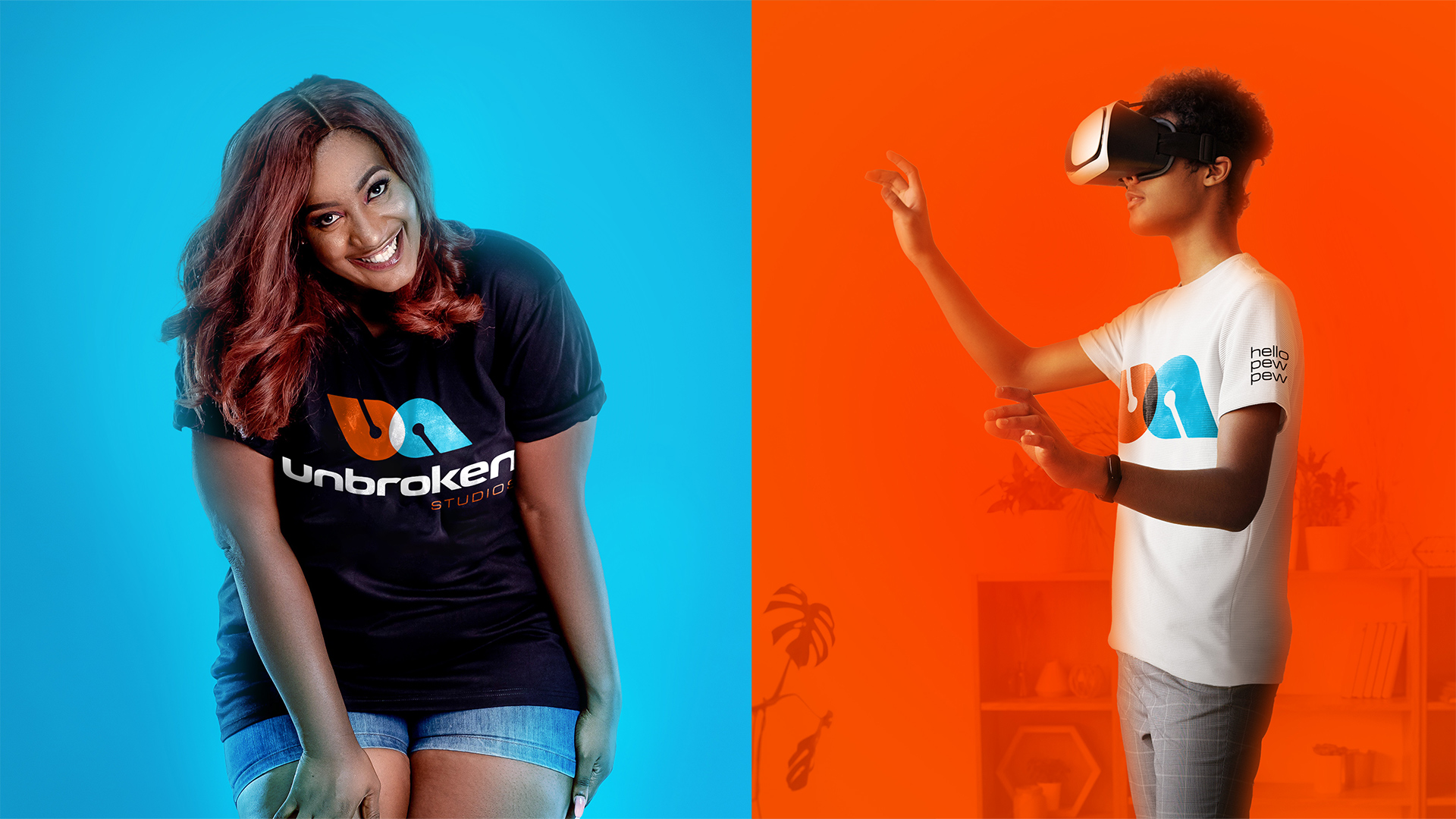
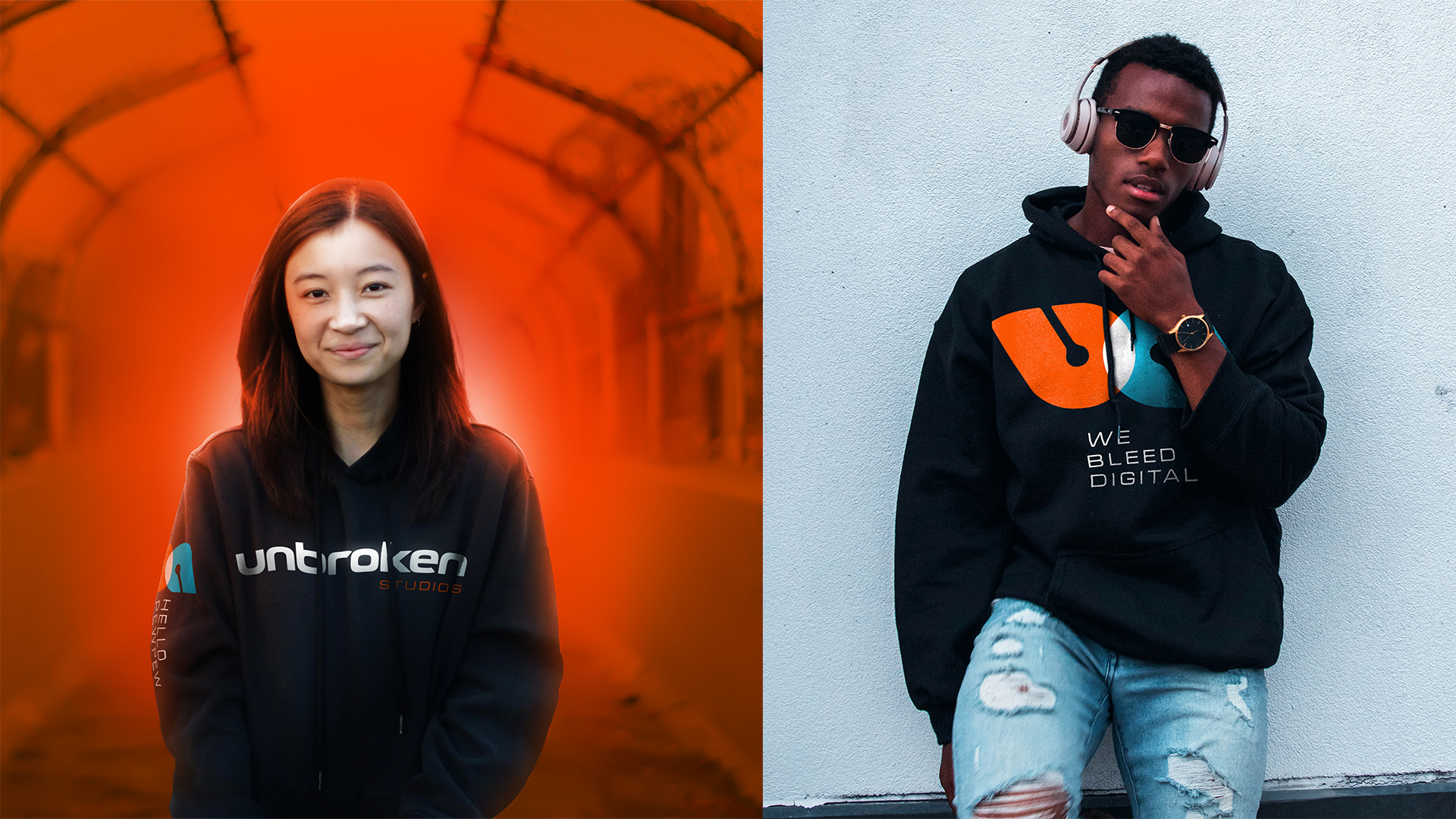
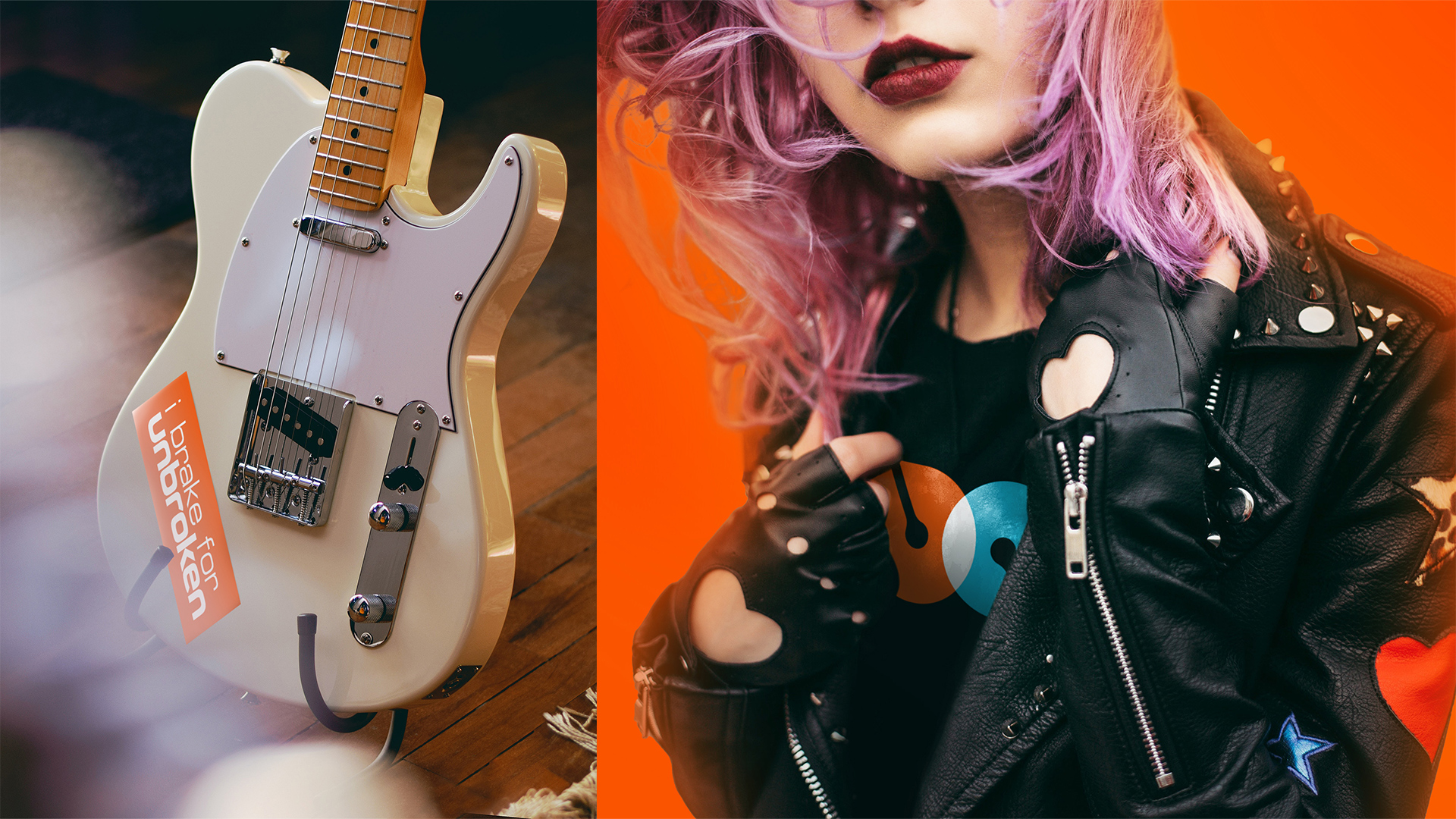
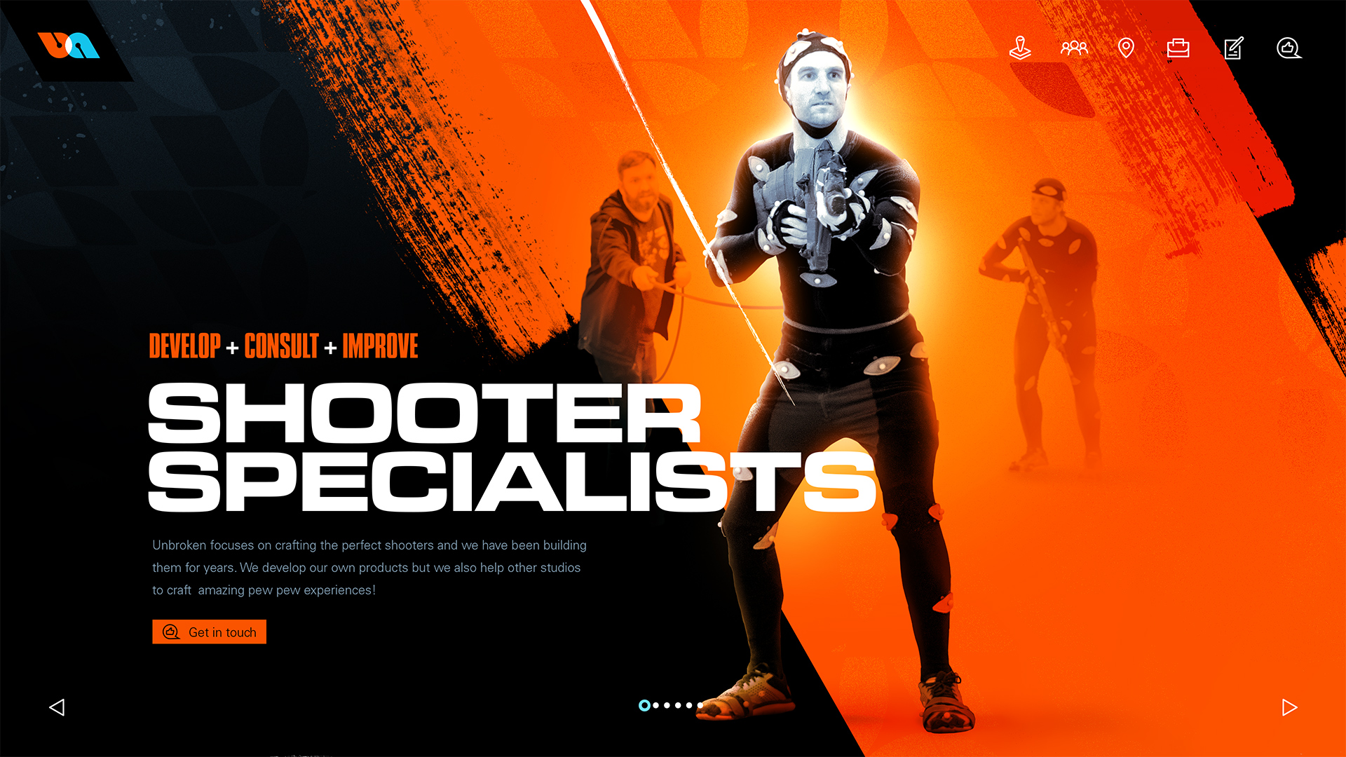
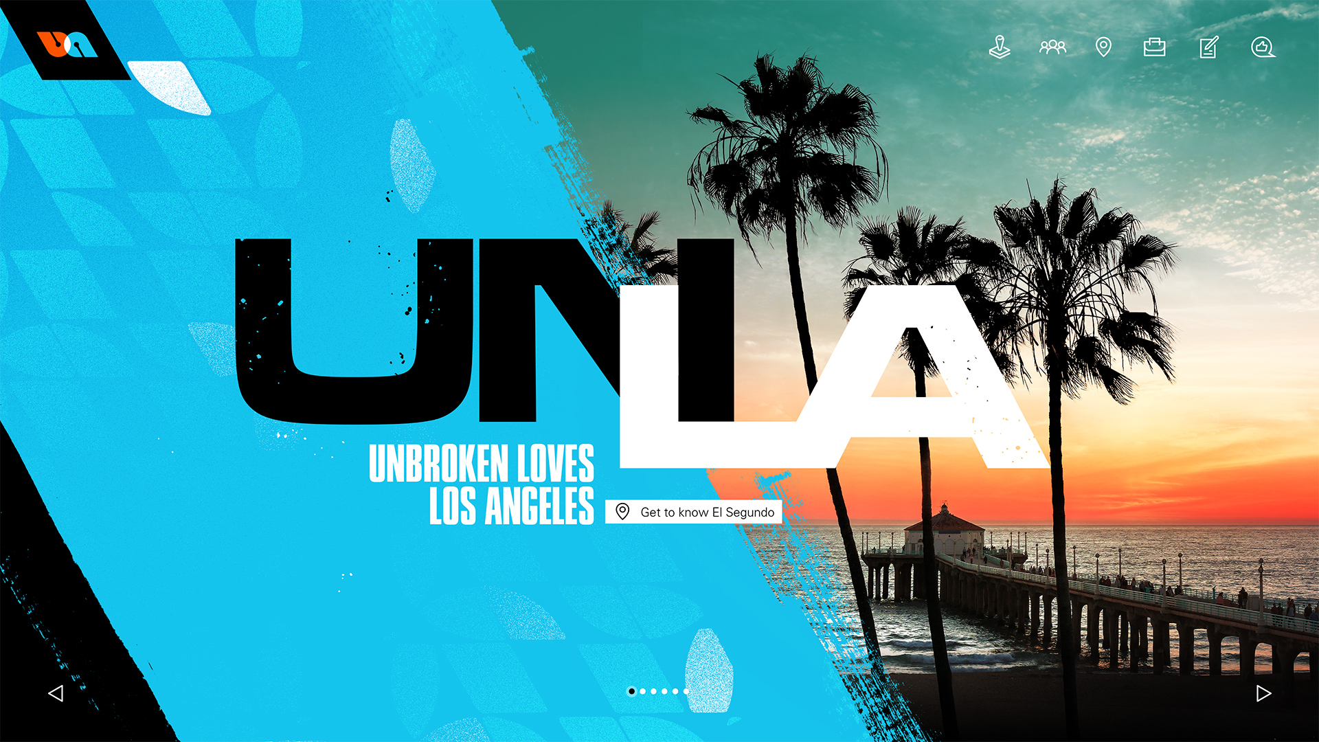
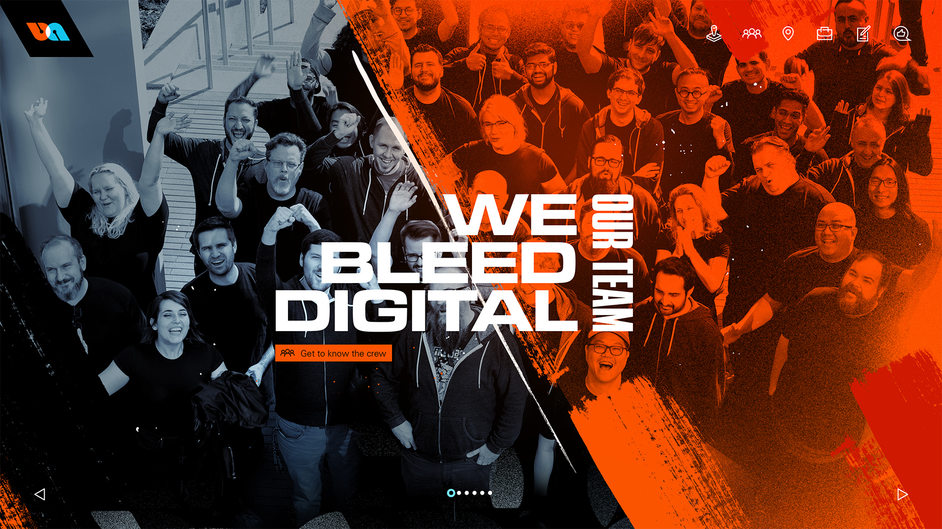
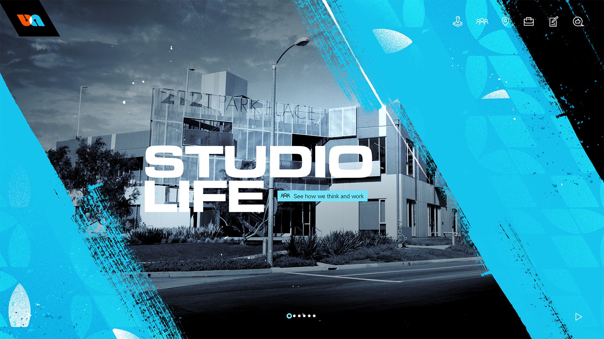
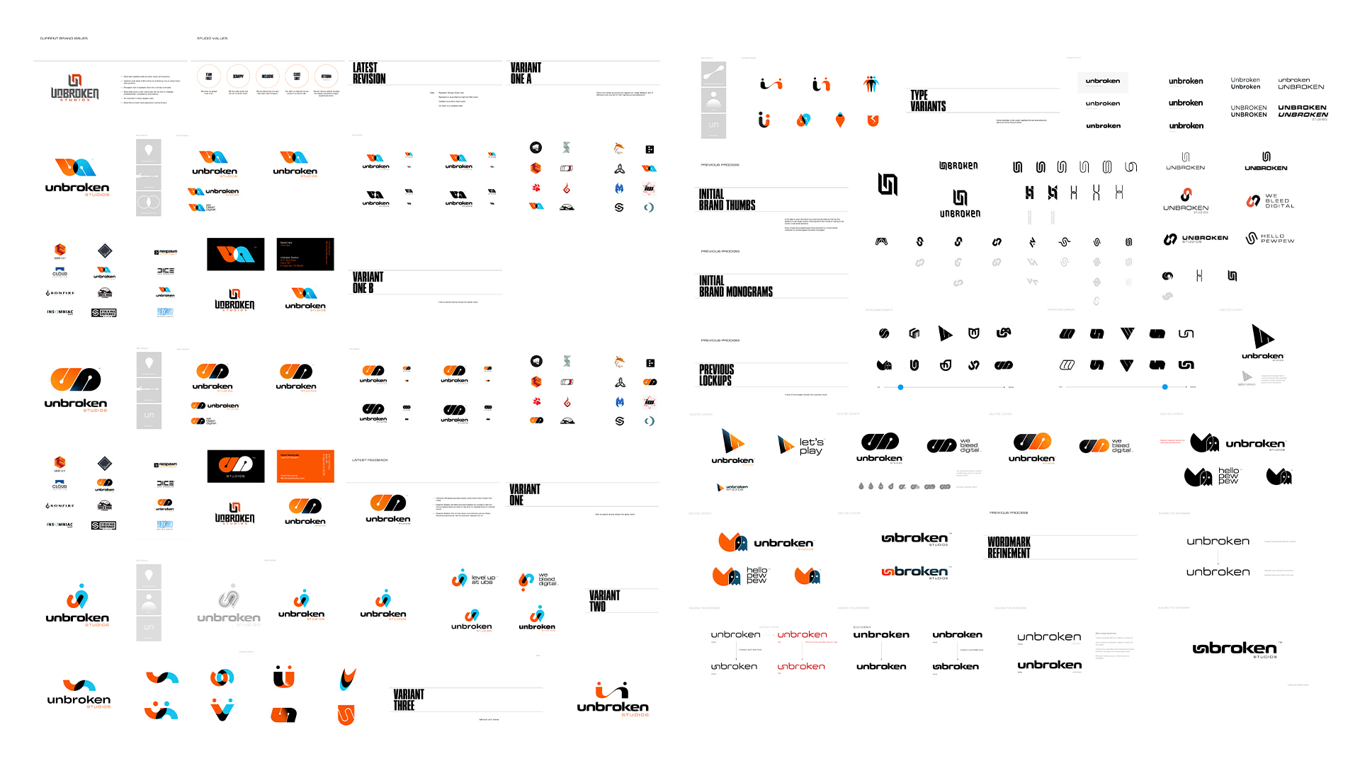
A sample of materials developed for the Unbroken Studios rebrand. With the new COO and myself starting at around the same time we both thought it important to make sweeping changes to the brand and public facing image of the company in order to better reflect the studio’s staff, its values, and its ambitions.

The updated brand seeks to portray:

  1. The collaboration (overlapping) of talent
  2. The studio love of games (way point markers which double as letter forms)
  3. The studio’s focus on shooters (subtle tracer rounds form the counters)
  4. More dynamic, less masculine color scheme and more neutral (less hard angular) forms


HERO PIECES

Multiple motion pieces are being developed using various resources. Jacob Gilbreath is currently working on our main version with myself directing the visuals and production. This is his currently in progress piece– shown here before final timing, post process effects, final lighting and color grading.

IN PRACTICE

In addition to standard materials such as studio decks, social media content, printed materials etc the rebrand was also an exercise in reinvigorating the studio and creating materials the staff could be proud of and happy with without feeling like propaganda.


WEB AND MORE

Some examples of visual targets that were paired with an XD prototype for the studio’s updated one page website. These materials were delivered to and iterated on with an offsite developer who built out the site to our specs and adjusted for feedback.


SLICE OF PROCESS

In order to both cast a wide net and also help the staff to have a vested interest in the updates they were included at certain points so that feedback could be gathered and adjustments made if objectively valuable (or just better ideas in general). I also sought to draw on my extended network of talented friends for reactions, feedback, and ideas.